Challenge
How do I provide a way for users to ask specific questions to solve their problems because their resources [time/money] are limited and traditional sources of help have failed to meet their needs?
Goal
This project aimed to learn what pain-points users of these types of services experience and the opportunities in the current market could give an advantage to a competing product(omit or re-write the previous sentence). I aim to improve access to accurate information from reliable sources, which is both economical and timely while reducing the noise often seen in crowd-sourced message boards.
Outcome (NEEDS EDIT!!)
Cultivating a roster of experts from various backgrounds, Learning Pad will provide support to even the most niche inquiries. Implementation of a robust search function will help users achieve expedient and accurate pairing of content. I will also implement a crowdsourced network for undergrad students seeking input from experts for academic research from their peer group.
My Role
I was the sole designer for this project conducting all phases from discovery to final designs ready for development.
Duration
This project took approximately 10 months.
Tools Used
Adobe XD
Sketch
Survey Monkey
Optimal Workshop
Sketch
Survey Monkey
Optimal Workshop

User Interviews
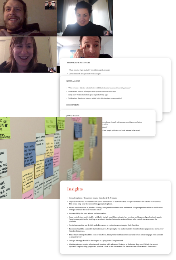
After researching our competitors, I wanted to understand the motivations, behaviors & challenges of our target user base and common pain points experienced while using other research tools and peer-to-peer information sharing platforms in the current market.
Summary
First...
I scheduled video interviews for convenience and efficiency with persons who would find the product helpful.
Next…
I extracted relevant information into different categories reflecting subjective versus objective observations.
Then…
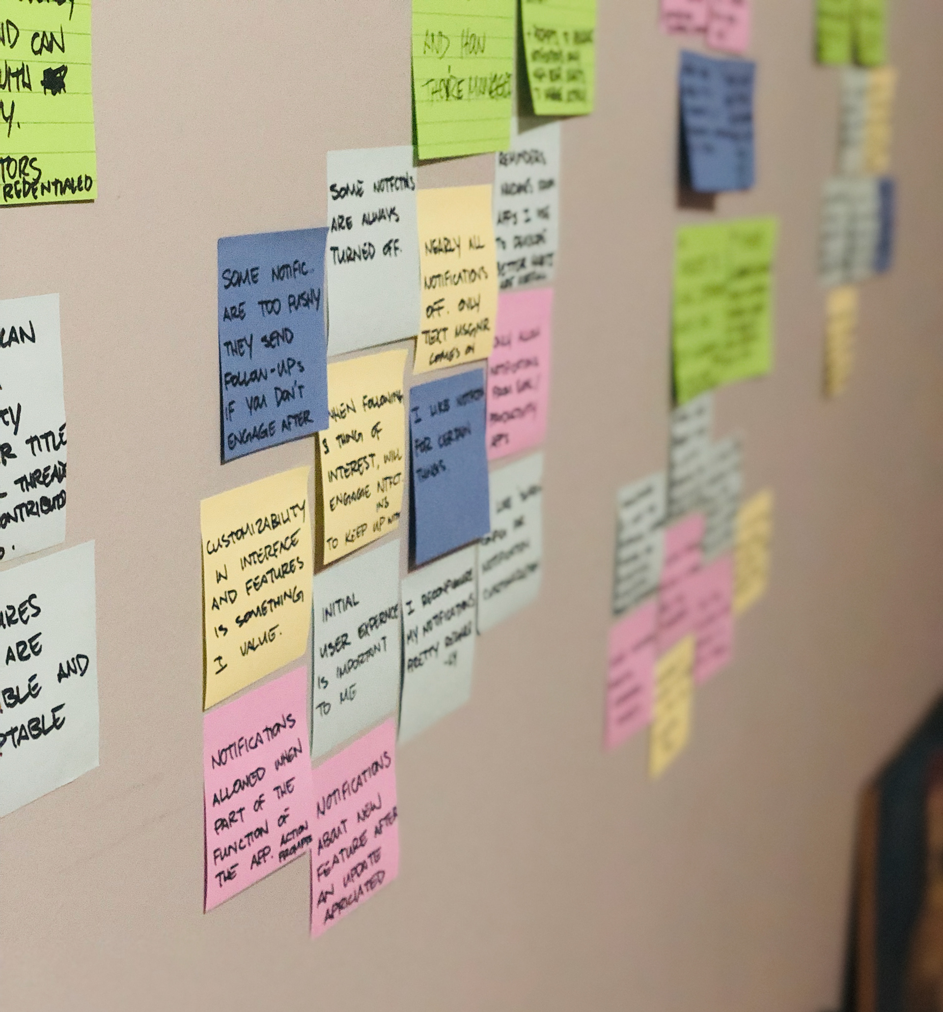
I used affinity mapping to help me find patterns and common themes in the collected data.
Finally…
The largest clusters with the widest representation became key insights that would underpin all future design choices.
Takeaway
Insight
Pushy conversion tactics imposed on new users will cause mistrust and end their use of our product.
Solution
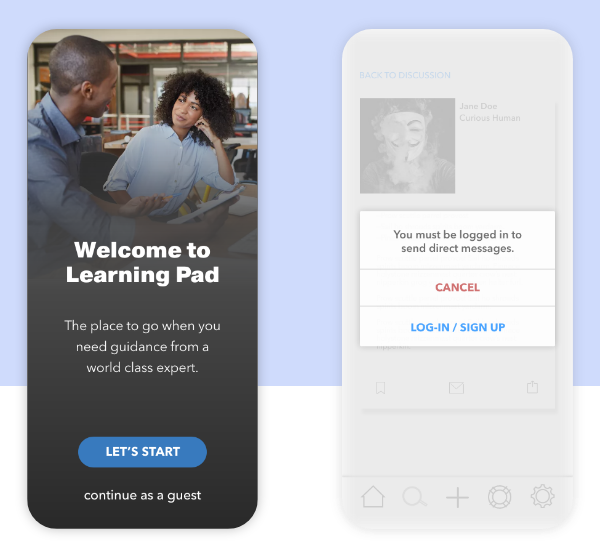
Visitors were allowed to move through the site and app freely without having to sign up or share any personal information.
Visitors were allowed to move through the site and app freely without having to sign up or share any personal information.
Insight
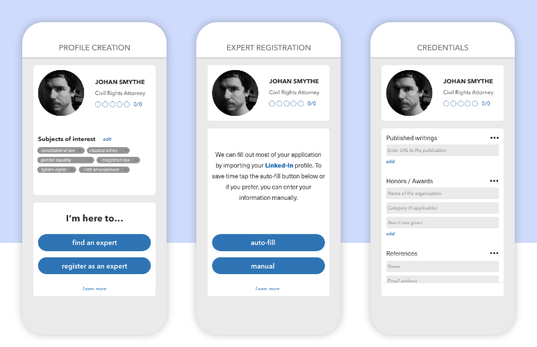
To attract quality experts and, ultimately, our end-users, the credibility of Learning Pad must be established through transparency and accountability of its Experts.
Solution
Experts would be vetted and would need suitable credentials to answer a user’s question.
Insight
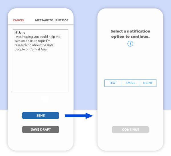
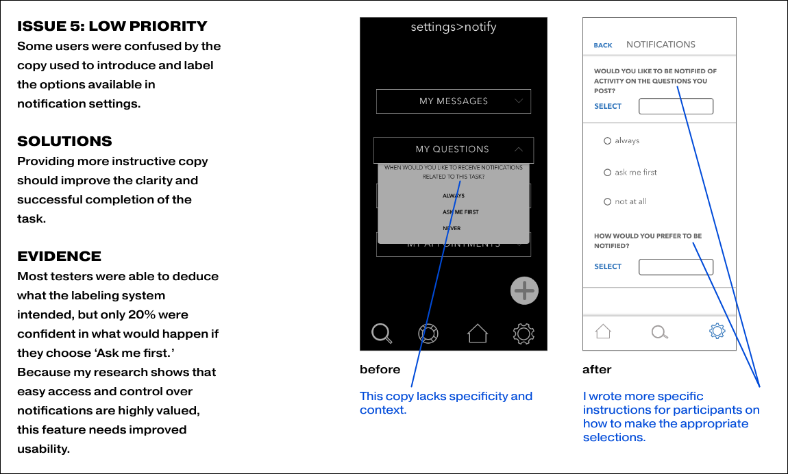
The ability to adjust notification settings easily would earn trust and increase the engagement of both Experts and Expert seekers.
Solution
A prompt for users to choose their notification preference as well as a direct link to manage notifications at a granular level was created.

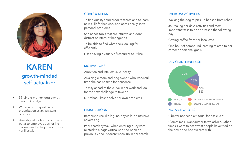
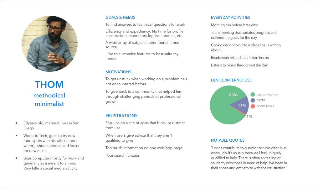
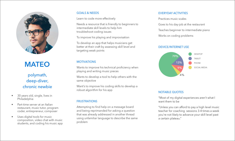
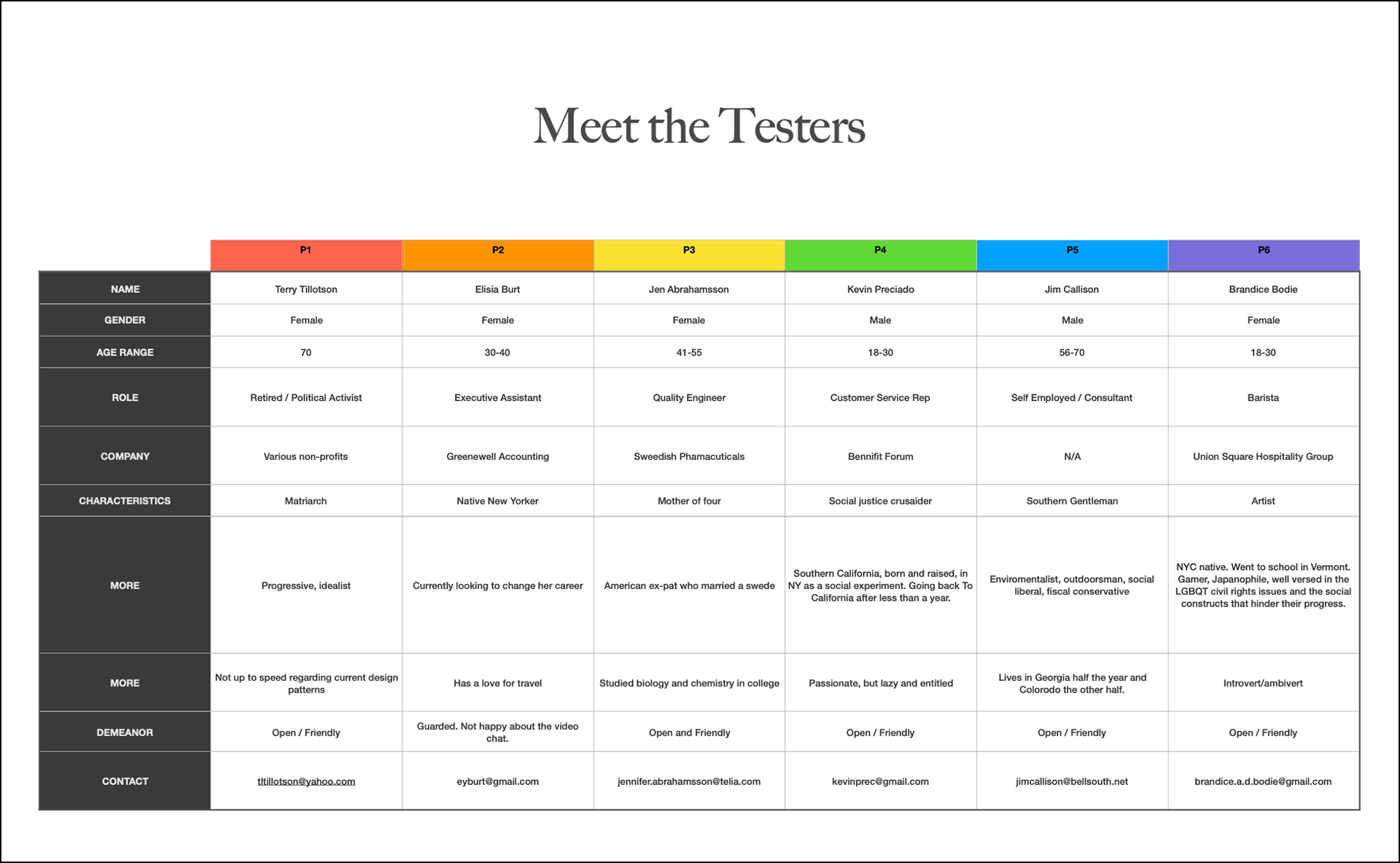
Persona Creation
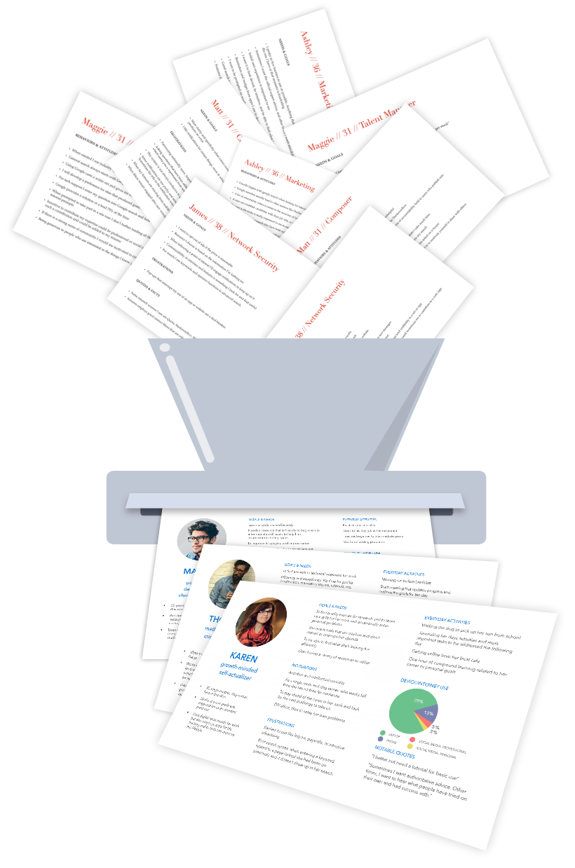
I wanted a reference point to maintain focus on user needs and challenges throughout the design process. Imagining situations not covered in the research was vital to successfully address their needs.
Summary
This was achieved by taking the learnings from user research to form user personas that represent the key demographics that this product is intended to serve. I addressed lifestyle, motivations, goals, and demographics.
Karen, our primary persona represents our core user base.
Thom who represented the experts is important to design for in the interest of retaining our end users.
Mateo represents an edge case. Someone likely to use Learning Pad but with uncommon needs and goals.
Primary Persona
Secondary Persona
Edge Case
Takeaway
Designing for the experts is just as important as designing for end-users.
The pain points that were dealbreakers for our personas were shared in most cases and thus easy to make a priority.

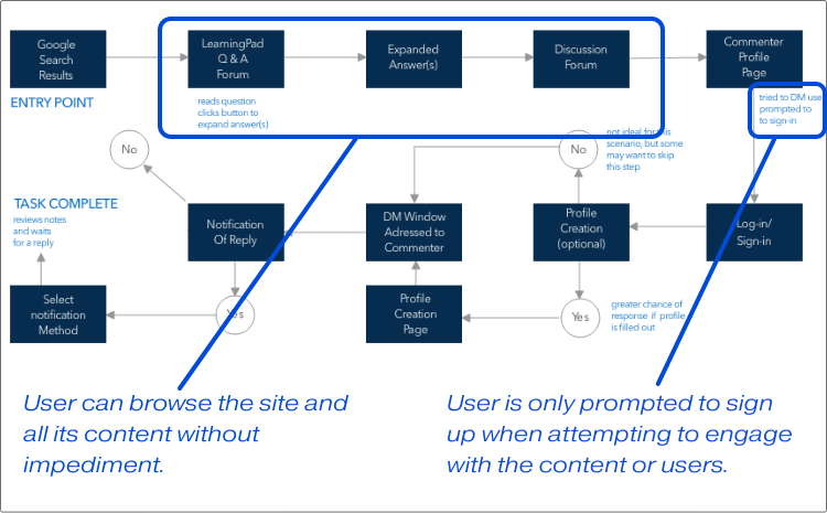
A common pain point for our personas was being required to make an account before being able to test drive the product. As a result, I chose to allow full browsing ability to any visitor. Creating an account is only required when attempting to interact with other members or adding new content.
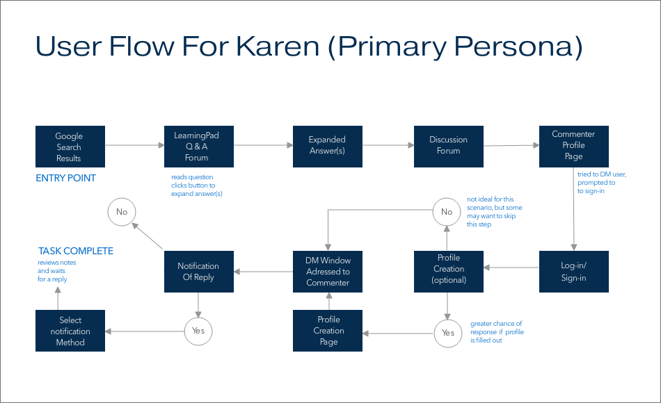
User Flows
To remain focused on user goals and avoid drilling down into details too early on, I created user-flows based on my personas and the product requirements. This also provided insight into the app's information architecture.
Summary
I started by evaluating the primary needs and goals of our primary persona, Karen. Then I translated that goal into a list of the steps needed to complete her task. Finally, I made a user flow that showed each interaction necessary for her to meet that goal.
Takeaway
Insight
Users should have access to existing content without the barrier of account creation, demonstrating value to the user, and earning their trust.
Solution
I chose to keep the log-in portal on the home page and only prompt users to sign up should they attempt to engage with other members or use the site's features.
Insight
Users should have easy access and control of notifications should they have specific notification needs.
Solution
Users will receive a prompt to select notification preferences when sending messages, thus providing agency in their engagement with the app.
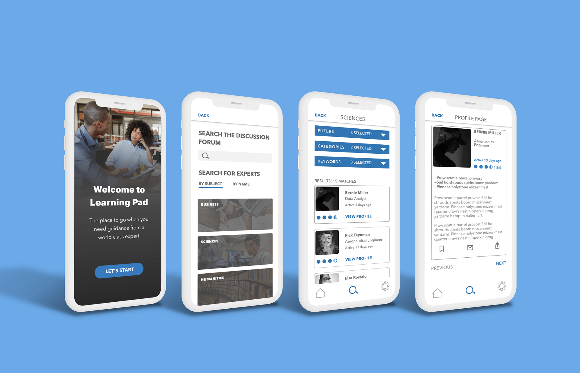
Building the Prototype
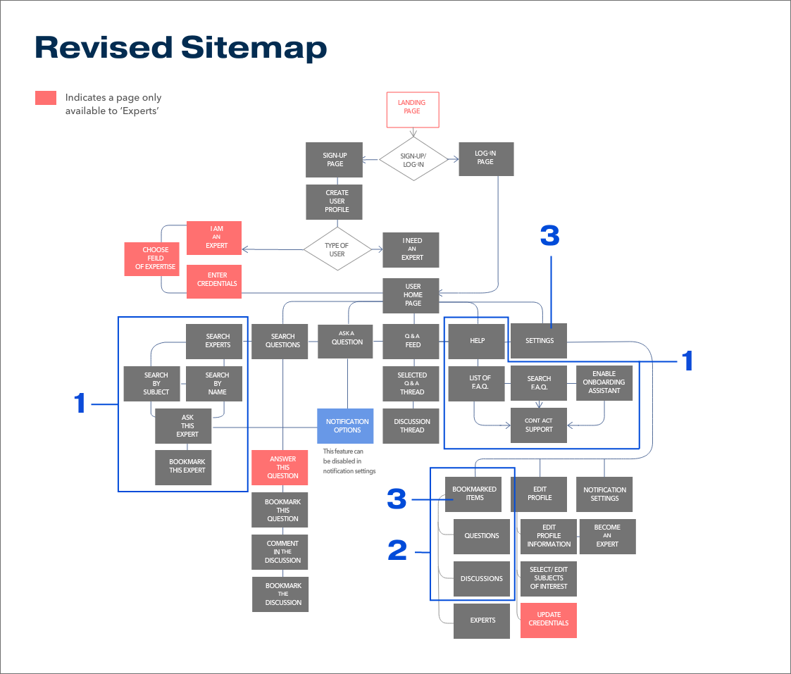
With user flows in hand, I created a sitemap to visualize and assess the app’s navigation. After conducting a card sort and redesigning the sitemap based on the results, I began building a prototype to test for usability.
Summary
I created a sitemap based on my user-flows. Then I conducted a card-sort study and revised the sitemap based on the findings of that study. For a detailed view, click on each sitemap.
Takeaway
1. A consensus was reached in the grouping of the categories Search Experts and Help during the card sort.
2. To streamline the navigation, I changed the Saved Items category into a subcategory under the Settings menu.
3. Nearly 39% of the cards cataloged showed no clear consensus. The pattern that emerged seemed to indicate issues in the labeling. I resolved this by looking at the naming conventions used in similar apps and verifying with another card sort.

>>
1. The Search Experts and Help categories earned a place in the navigation tab, based on the consensus reached during the card sort.
2. Bookmarked Items became a subservient item under Settings to streamline the navigation and reduce cognitive load. Further streamlining also led to the consolidation of the Search Experts and Search Questions pages into a single navigation tab labeled Search.
3. The term Bookmark was more familiar to participants of the card-sort and subsequently replaced the Saved Items category used in the initial sitemap.
Usability Testing
At this point, I needed to see if the prototype I built would function as intended. By conducting user testing, I hoped to learn if the instructive copy was clear, the information hierarchy matched user expectations, and they were confident that they completed their tasks successfully. The three key features I tested were posting a question to the community, change notification settings, and search the roster for an expert.
Summary
Moderated Testing
I chose remote moderated testing using Zoom for this project. In doing so, I made it possible to work with a diverse sample of people outside my city while still observing non-verbal cues and guiding users when they got stuck on a task.
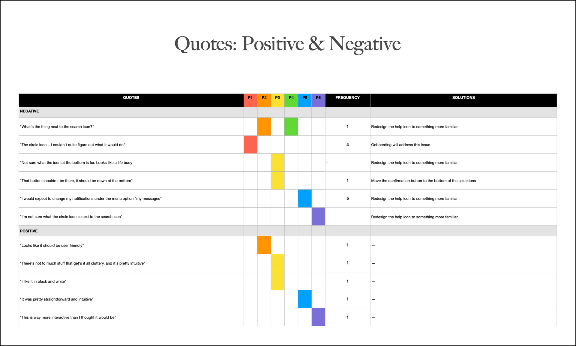
Affinity Mapping
All comments from the participants and non-verbal cues observed during the test were recorded on a post-it note. The notes were then grouped based on similar responses to a particular task, page, or feature in the app.
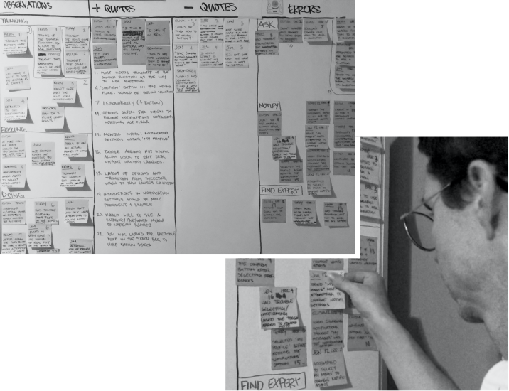
Spreadsheets
Then I transferred the patterns that emerged during affinity mapping to a rainbow spreadsheet. The spreadsheet revealed quantifiable metrics allowing me to assign priority rankings to each usability issue uncovered during the tests.
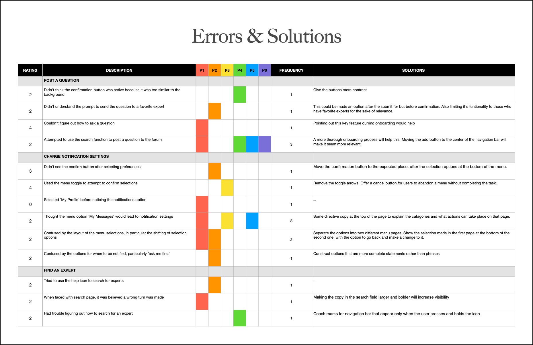

Takeaway
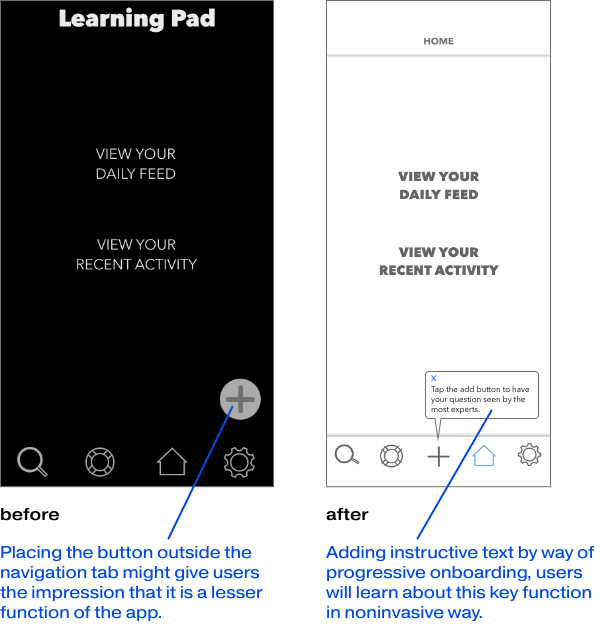
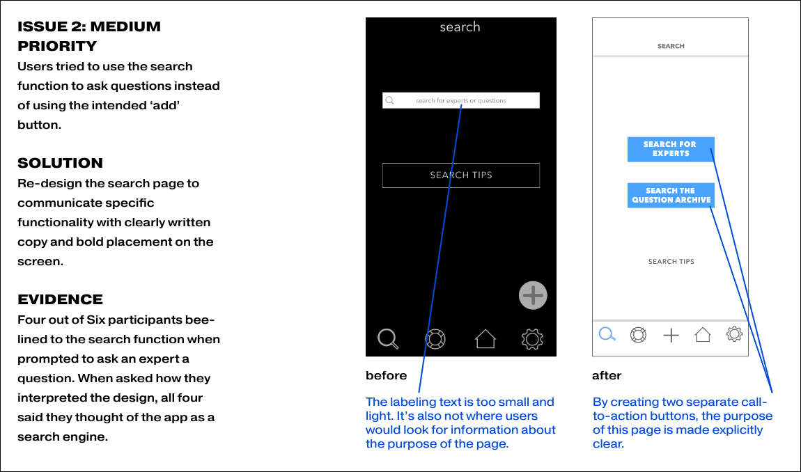
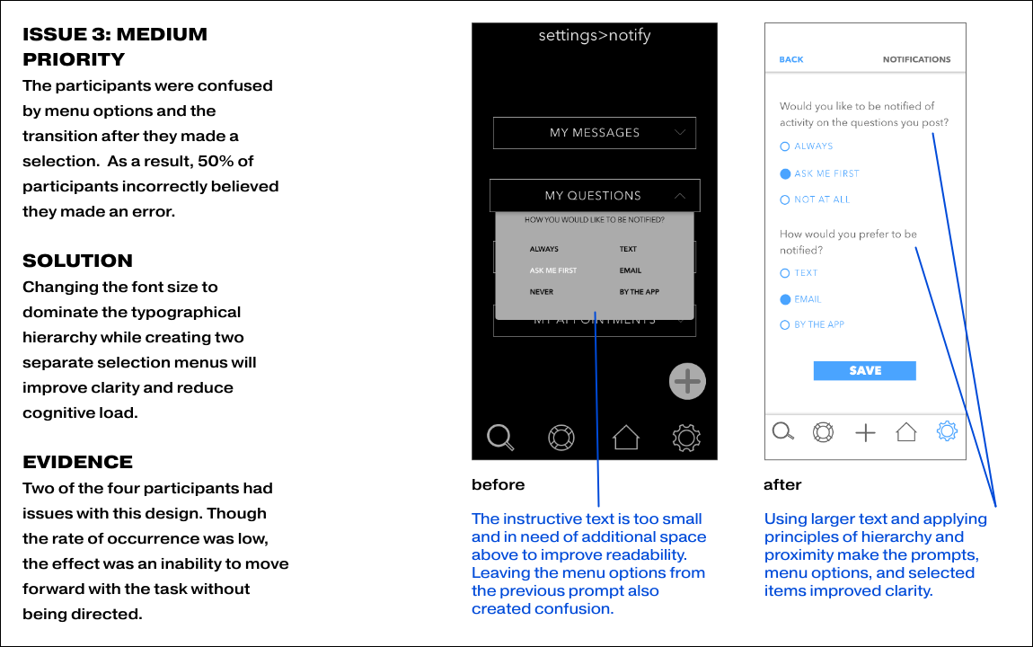
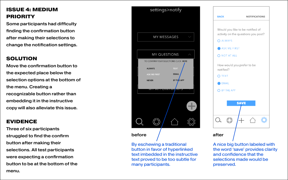
ISSUE 1: HIGH PRIORITY
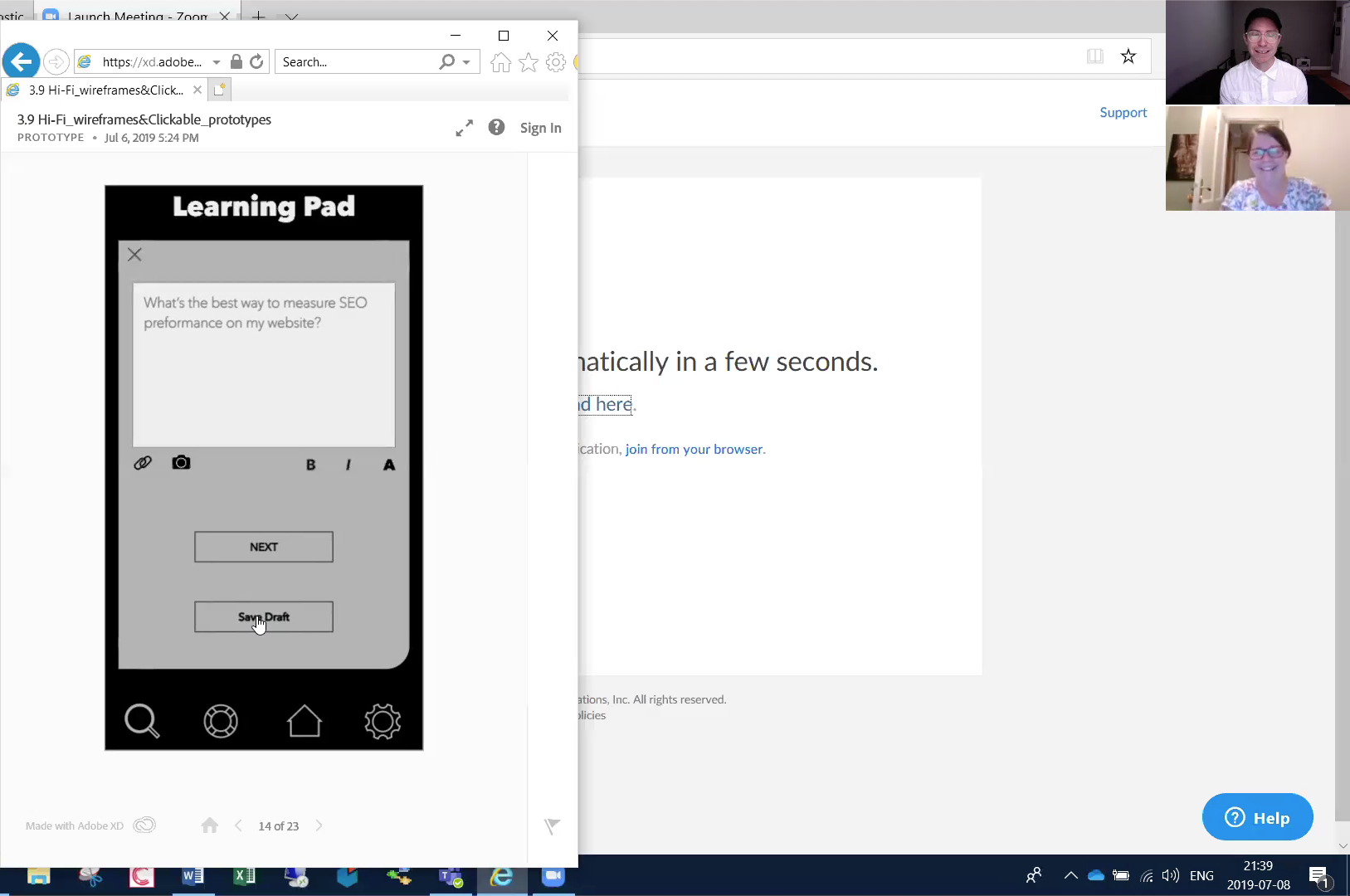
When attempting to post a question to the community, all users overlooked the add button.
SOLUTION
Pointing out this key feature through progressive onboarding would help.
EVIDENCE
All six participants overlooked this button as the means to publish their questions publicly. 66% attempted this task by using the search function.
* Click on the images below to see additional issues and their solutions.
Iterate Test Learn Repeat
Here I'd like to demonstrate the evolution of key features and the process that informed the changes made in various iterations—starting with low fidelity wireframes to high fidelity screens ready for developer handoff.
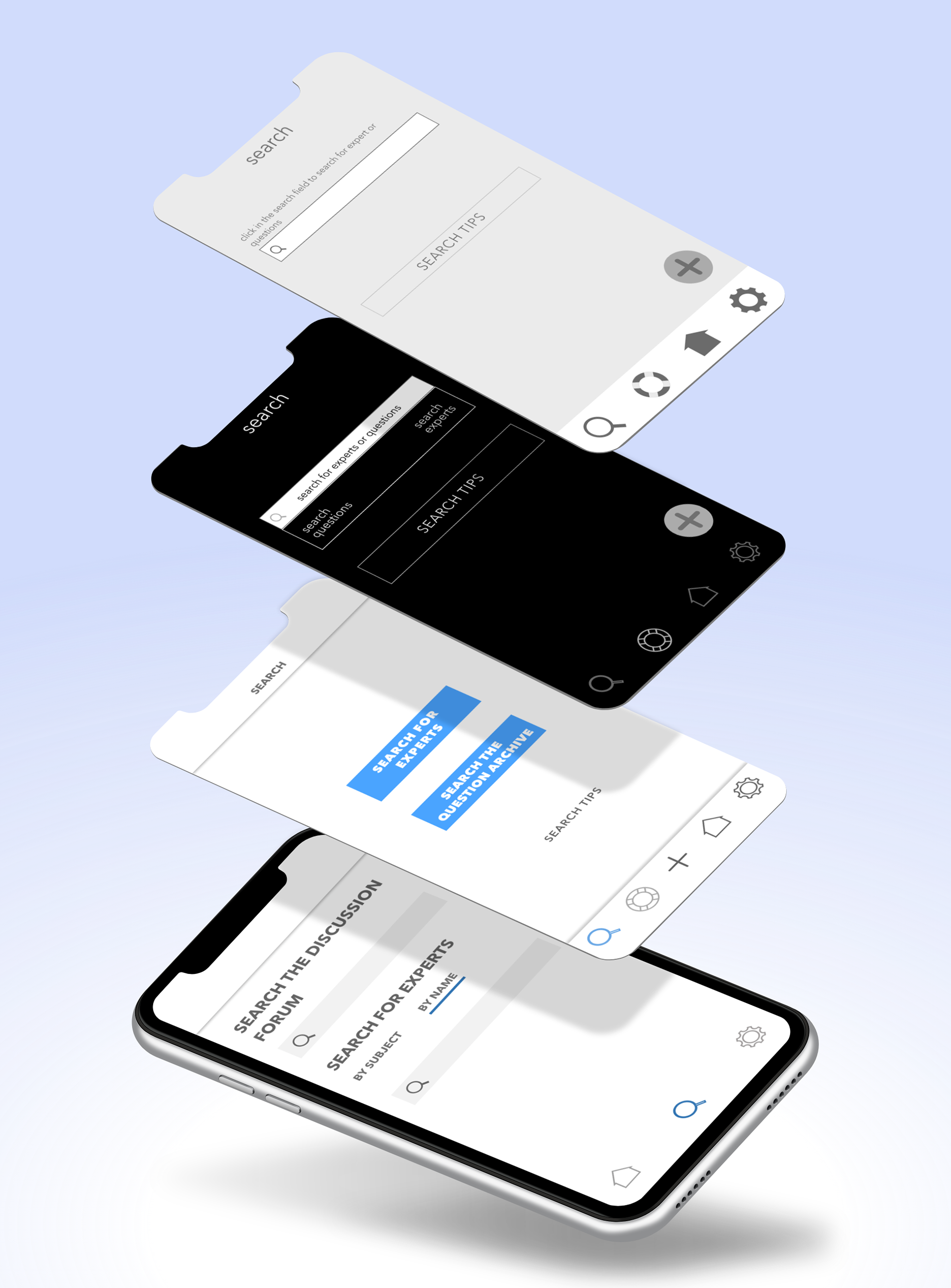
Low Fidelity
The first digital wireframe of this screen had contrast in all the wrong places. The icons were bulky and visually distracting and the grey background made the text difficult to read.
Mid Fidelity
During the first round of refinements, I experimented with a dark theme in the hopes of improving legibility. Later I would find that font size and contrast would resolve this issue.
Hi-Fidelity
The initial design made the search field double as a picker menu, which seemed clever at the time, but ultimately slowed down users.
Polished
Consolidating the search options on one page with simple copy in a bold typeface to guide the user added clarity and speed to the task.
Low Fidelity
On the first couple of screens, the ‘add question’ button was floating on the bottom right corner of the page.
Mid Fidelity
After user testing, it was learned that this option lacked context and understanding of the button's purpose.
Hi-Fidelity
The options under the notifications categories were changed to a drop-down menu on the same page saving on load-times, adding dexterity to the task.
Polish
The most current iteration streamlined the UI, stripping away anything that didn’t provide clarity. The text was adjusted to improved accessibility for those with impaired vision.

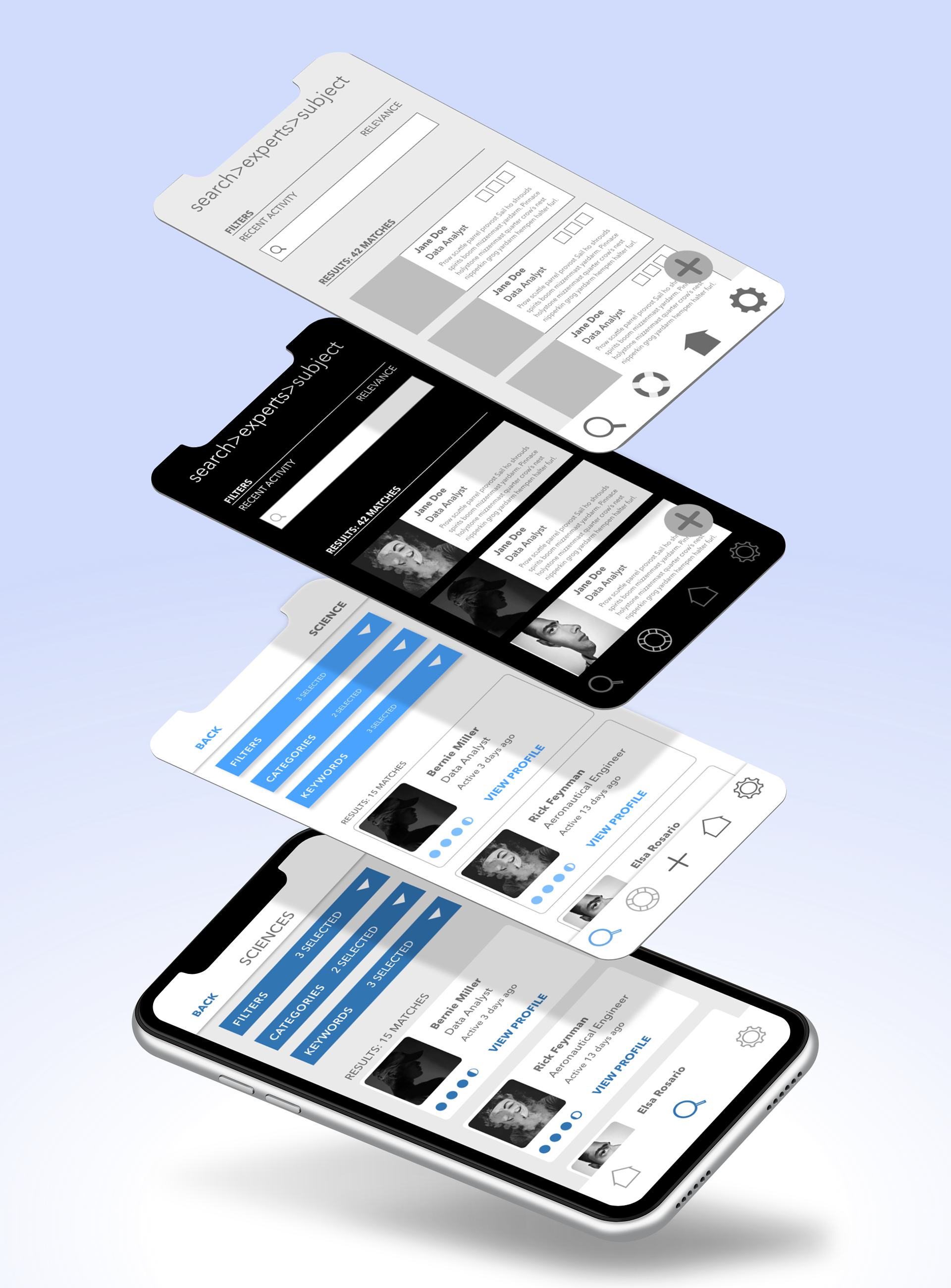
Low Fidelity
In the early stages, a breadcrumb feature was used for navigation but found using the navigation icons along with a page title in the navigation bar to be sufficient.
Mid Fidelity
After user testing, it was discovered that a search field was too ambiguous so topic pickers and filter options were applied.
Hi-Fidelity
From peer reviews and accessibility design, it was discovered that the blue being used lacked the contrast needed for clarity.
Polish
Several elements of text were too small and the profile cards themselves were too crowded for the content to fit comfortably.
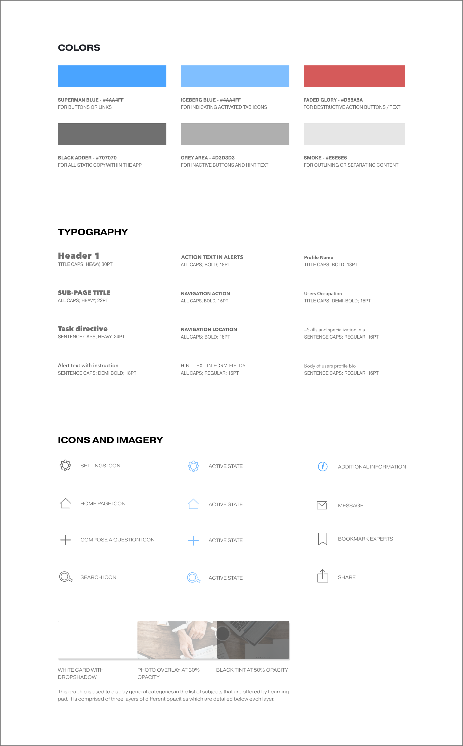
Style Guide
I created a Style Guide which included standards for typography, color, iconography, and components. Having a style guide with a library of functional components made designing additional screens more expedient. In addition, it allowed me to focus on the quality of the overall interaction rather than visual details like hierarchy, spacing, and font size.


Lessons Learned
What went well?
Using affinity mapping to gain key insights based on user research interviews
Skills used:
Imagination, Empathy, Listening, Pattern Recognition
Imagination, Empathy, Listening, Pattern Recognition
Processes:
Data extraction from interviews, affinity mapping
Data extraction from interviews, affinity mapping
Solution:
Explore other scenarios where this method is suitable or could be adapted
Explore other scenarios where this method is suitable or could be adapted

What was problematic?
Extracting relevant information from user testing.
Skills used:
Test design, script construction, test moderation
Test design, script construction, test moderation
Processes:
Moderated remote user testing, reviewing videos, transcribing relevant findings
Moderated remote user testing, reviewing videos, transcribing relevant findings
Skills gap:
Staying on topic. Taking notes in real-time.
Staying on topic. Taking notes in real-time.
Solution:
Stay on topic during testing with less discussion to validate testers confusion. Make notes of key findings along with the videos' time-stamp for later review rather than having to watch the whole video over to make notes of significant findings
Stay on topic during testing with less discussion to validate testers confusion. Make notes of key findings along with the videos' time-stamp for later review rather than having to watch the whole video over to make notes of significant findings


What needs to be improved?
Time management when polishing high-fidelity mock-ups and UI elements.
Skills used:
Visual design, prototyping, typography, color theory
Visual design, prototyping, typography, color theory
Processes:
Creating a component library from scratch. Creating typographic hierarchy. Creating a system for spacing between elements
Creating a component library from scratch. Creating typographic hierarchy. Creating a system for spacing between elements
Skills gap:
Time-management and utilizing symbols/component tools available in most prototyping software.
Time-management and utilizing symbols/component tools available in most prototyping software.
Solution:
Review tutorials to learn how to utilize component and symbol features as well as using time blocking to systems to keep my workflow on schedule.
Review tutorials to learn how to utilize component and symbol features as well as using time blocking to systems to keep my workflow on schedule.